In Q4 2022 Aegon has officially been sold to ASR and the following year we made preparations to merge our companies and customer base. As with many migrations the first priority is a product merger to cover legal bases. Secondly comes the IT as this is the most cost intensive. Somewhere between these two priorities are our customers who, from everyones personal experience, tend to have a sub-optimal experience. We know this can result in customers leaving and choosing different financial providers when it comes to ‘short-term’ services such as insurances, our goal market for growth.
I set out to get the customer back into our sights. In the end they are the ones who we do it for and they are the ones who allow us to do our work. If we start with their experience we can increase customer retention and make more efficient choices in terms of IT systems.
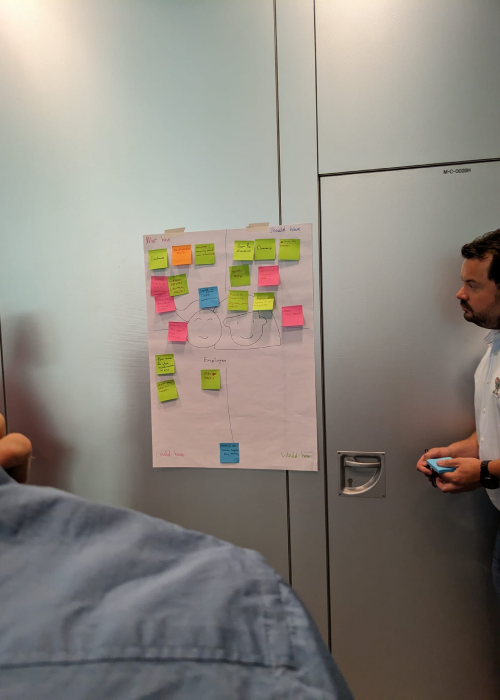
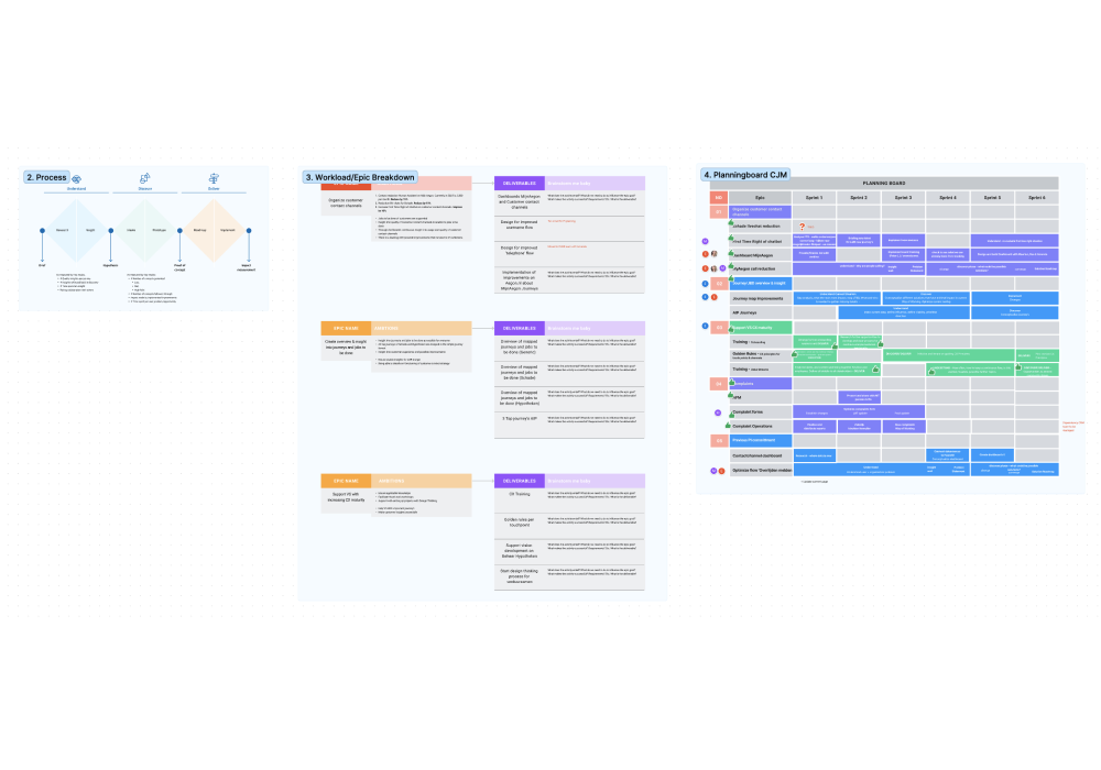
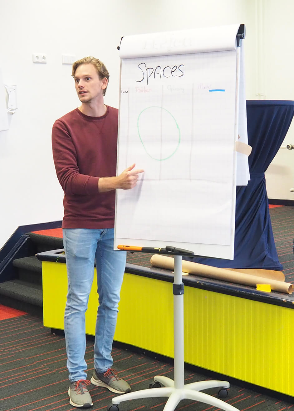
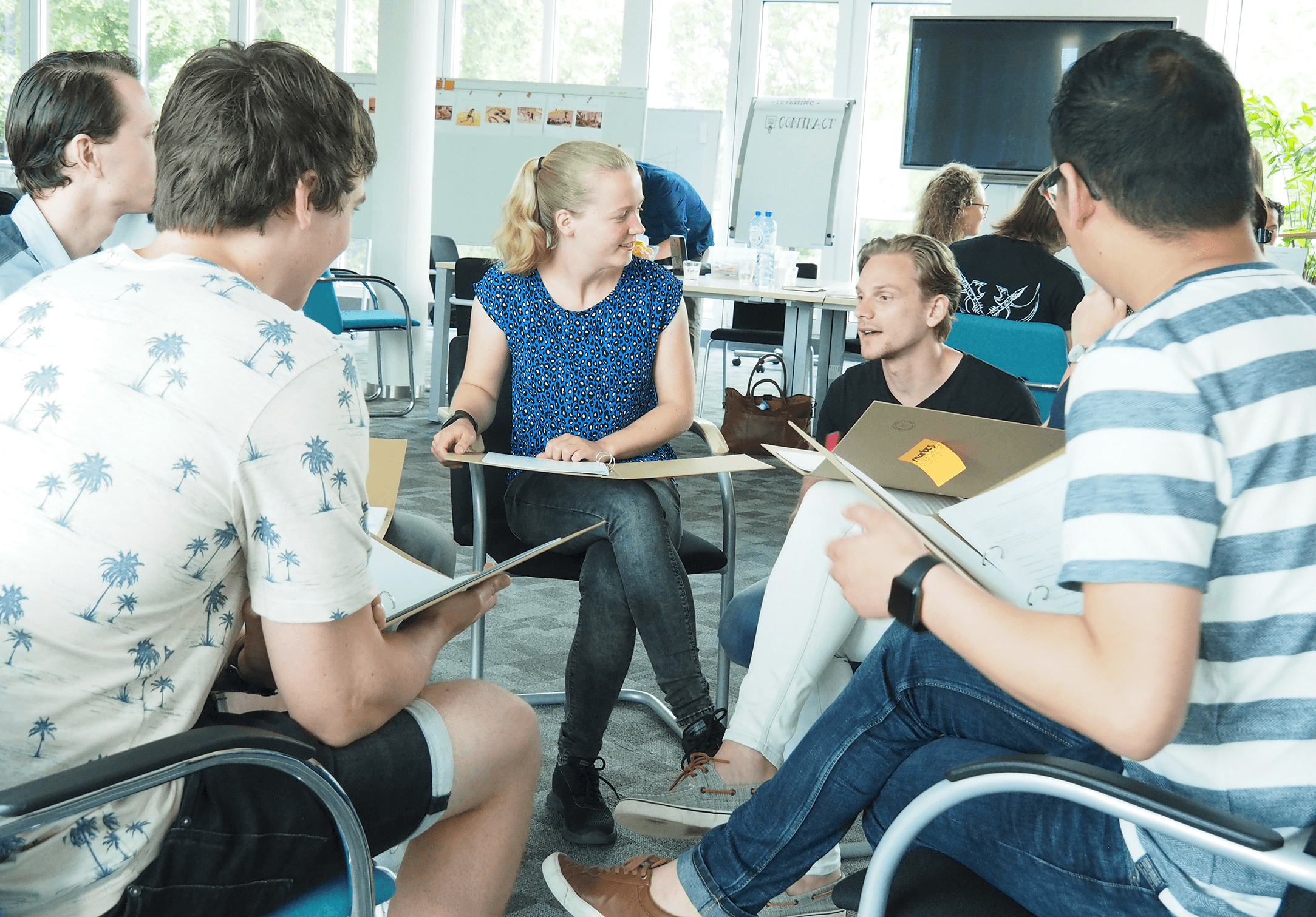
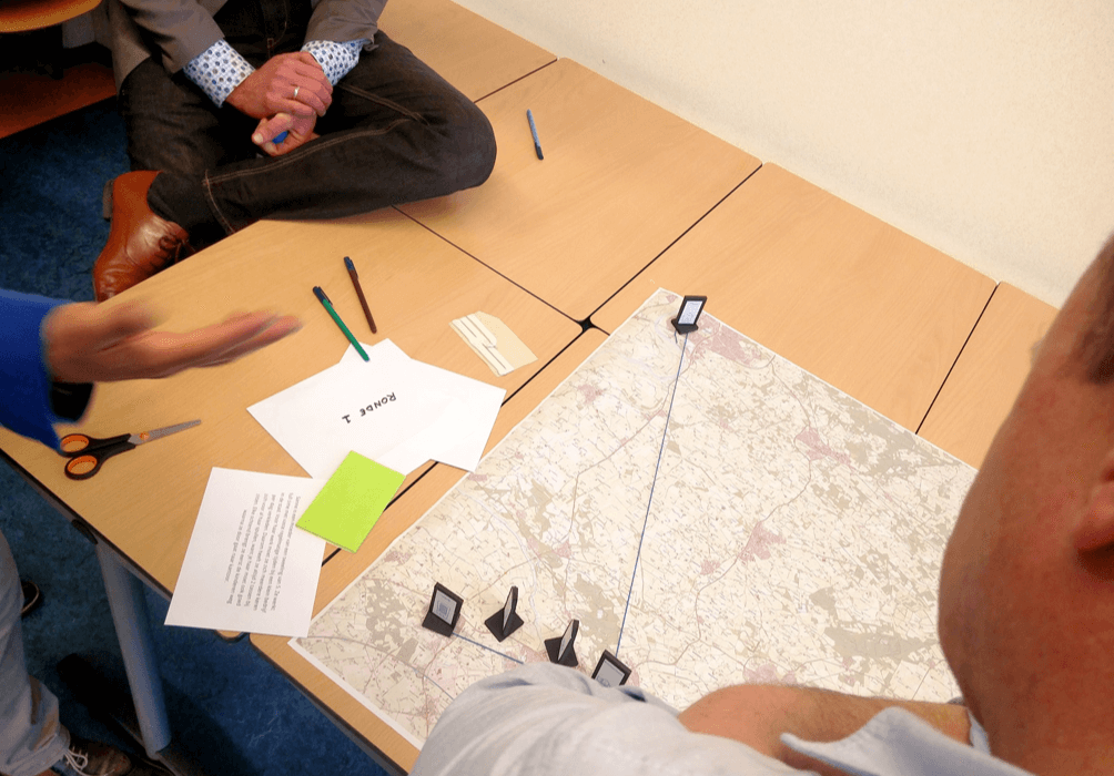
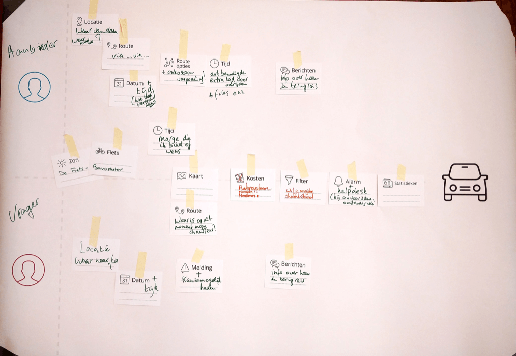
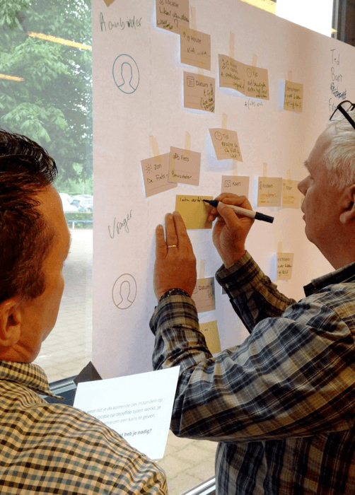
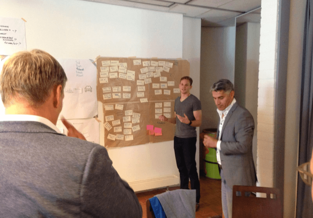
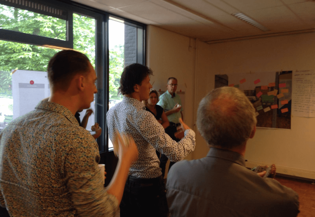
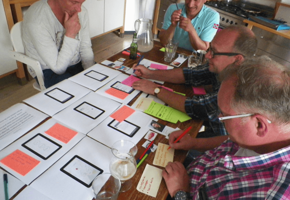
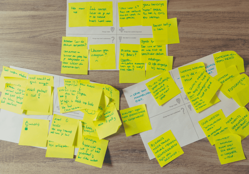
Together with the management team we decided to host 3 afternoon workshops during the preparation period. The first session was about getting to know each other. By going through different icebreakers we started building bridges between similar teams. Generating understanding of where Aegon customers were leaving from and joining a.s.r. From architecture we received several IT boundaries that we shared and ended up the session with a MoSCoW brainstorm around our customers, intermediaries and fellow employee’s. As a result everyone could share what they thought was important and find alignment on the set goals & vision. By strategically placing designers in the groups we maintained the human-centric perspective. One of the main challenges was: “How do we make the customer feel welcome?”
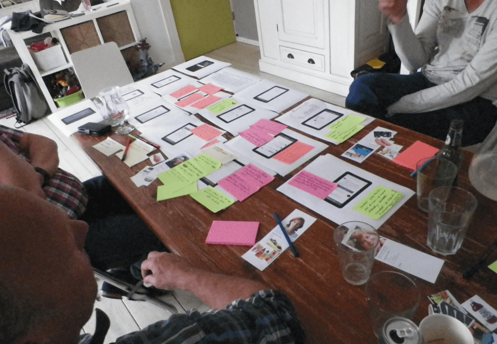
The second sessions build up on the first by continuing on the MoSCoW and translating it to customer journeys. How does it look like if we want to achieve what we find important? This resulted in several happy flows and service recovery initiatives. The third session went a level deeper and was a check-in for the teams to help them with their migration plans. These contained the required details to calculate costs & benefits.
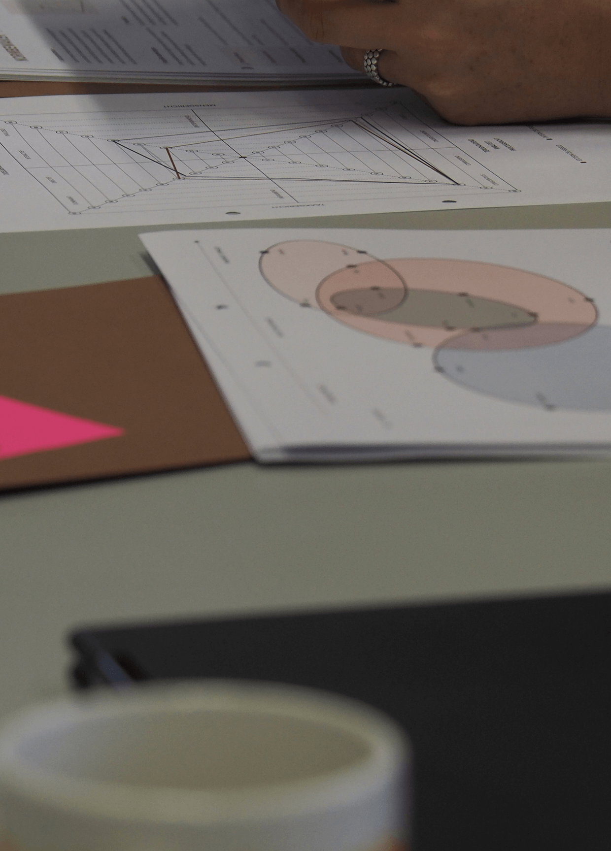
The results of the workshops gave input for the design team to conceptualise different customer journeys into prototypes from A to Z. Starting with the official legal letters every customer is required to receive and ending with a warm welcome in the a.s.r. environment. During the development of the prototypes we had several iterations that we validated with Aegon customers. Reaching out through e-mails to gather their thoughts and idea’s about the upcoming migration. Paralel we dived into the data to get a better understanding of what possible % of customers could receive what journey. Gathering up to 1.000 observations that were consolidated into 4 actionable insights to shape the work to make our migration the best migration ever.
In the end I converged all the knowledge into a slidedeck as a playbook; a plan to win the competition. The playbook has been positioned as a vision document for the upcoming 3 years on how we want the migrations to go in terms of customer experience and is used as a starting point for decision making by the decision makers.
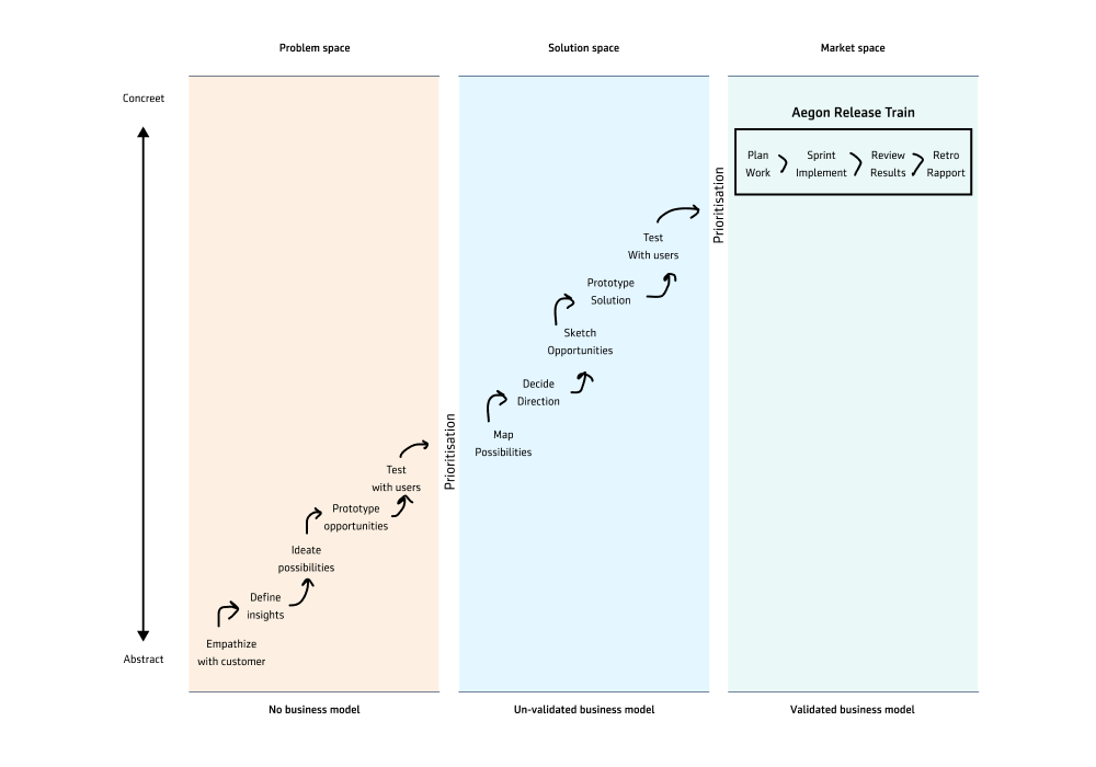
During my period in the Digital Strategy team at Aegon we identified as an organisation we’ve become very capable of implementing solutions that positively influence the bottom line but that we hit an invisible wall. Although the initiatives were successful from a silo perspective, several caused a rise in costs on other locations. For example the implementation of a new Customer Identity & Access Management service hit the initial target cost reduction on IT, but led to a major increase of calls.
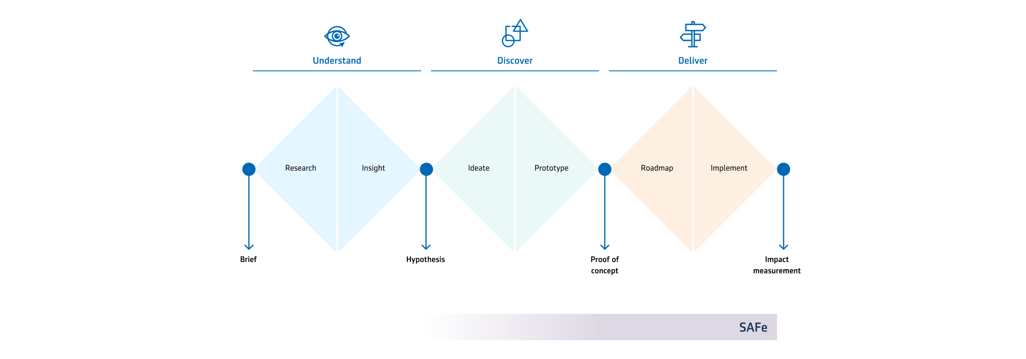
Together with our customer journey expert I managed to create buy-in to create a disciplinary team to implement a triple diamond approach on our initiatives. Whereas the customer journey management discipline helped us identify issues and opportunities, the triple diamond will help us bring about positive change from a holistic standpoint.
The challenge that Aegon as an organisation brings is its diversity in how it approaches its digital service delivery. Across business units there are different configurations of how the IT is organised, how services are delivered, how decisions are made and how bottom line profit is received. Instead of attempting to immediately overturn these structures and enforce the triple diamond we chose to approach it differently starting with: “What kind of structures are already in place that we can use, connect or overtake to achieve this?”.
Most of the business units applied the Safe 5.0 methods to manage delivery & implementation with specific owners for it’s entire A to Z. Knowing we can’t change much in that part of the organisation we knew we had to make changes in the front. The positive thing about Safe 5.0 is that it forces a clear start and finish, pillars that we can build our triple diamond on. Other colleagues understood this too and were making attempts to build innovation funnels for their own silo’s. We invited these key stakeholders to join us in mapping out how exactly the organisation works when it coms to service development and helping us build our stakeholder network by identifying other key players.
After several iterations we al felt we had the following 3 items crystal clear:
We purposely focused on different kinds of metrics to help us create a clear dashboard to help us keep grip on our work and it’s impact.
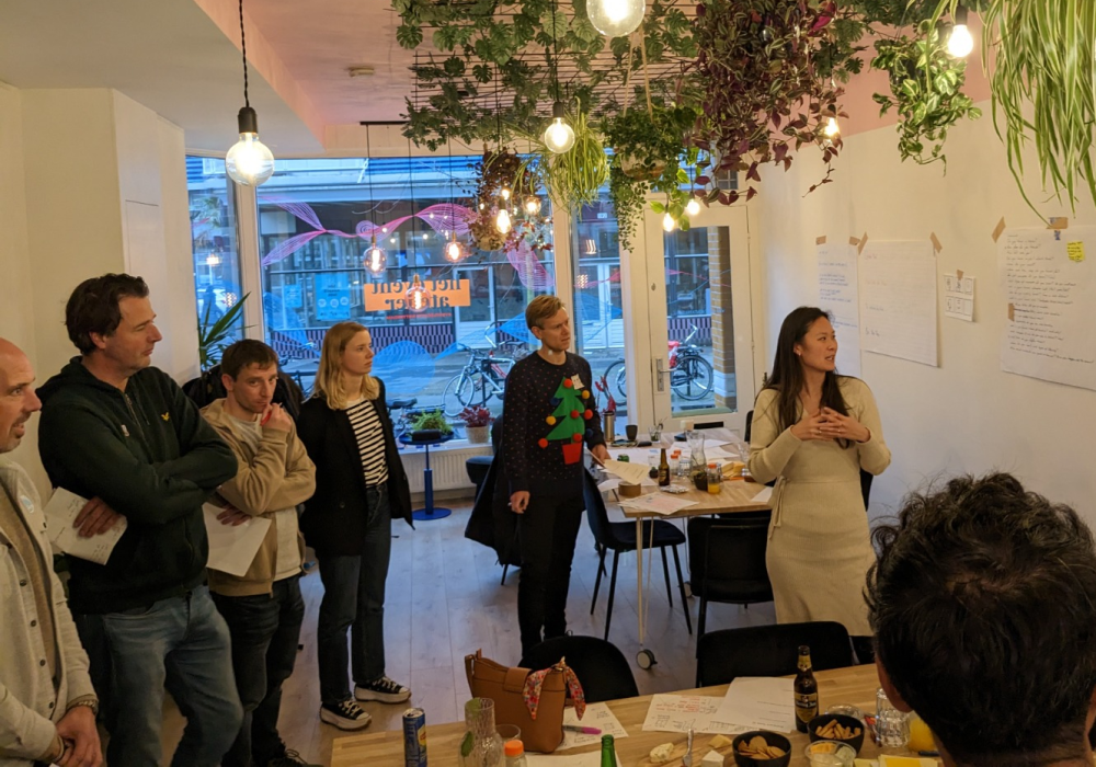
At different locations of our organisation I started facilitating hands-on experiences for our colleagues to get accustomed to the triple diamond and the type of thinking that it comes with. From completely digital sessions during CoVID to special christmas themed sessions at the end of the year.
Each of these sessions focused on 3 key points:
Paralel I was working with my design team to create concrete cases on how this way of working has helped us learn what works best for our customers. With some designers it was fairly easy to persuade product owners and managers to support us in this new way of working. In other corners of the organisation where time and budget were a higher priority I aimed for supplying and coaching interns to introduce them to the triple diamond.
As the awareness of the organisation started to grow and buy-in was increasing I managed to facilitate the decision to create a dedicated multidisciplinary team to fully dedicate it self on working with the triple diamond. Consisting of a complaints coordinators, service designers customer journey expert, data analyst, marketeer and content manager. We approached it as a pilot team with the aim of creating a blue print for the other teams. From experience we know that this would most likely be more abstract than concrete but hope it will suffice to get the learning loop started.
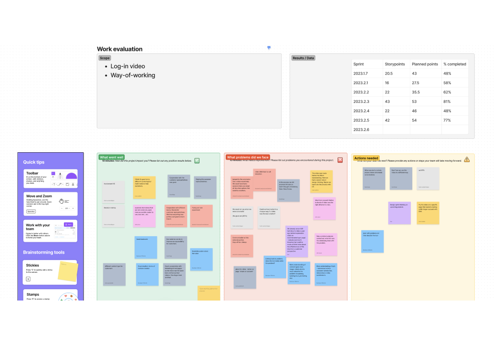
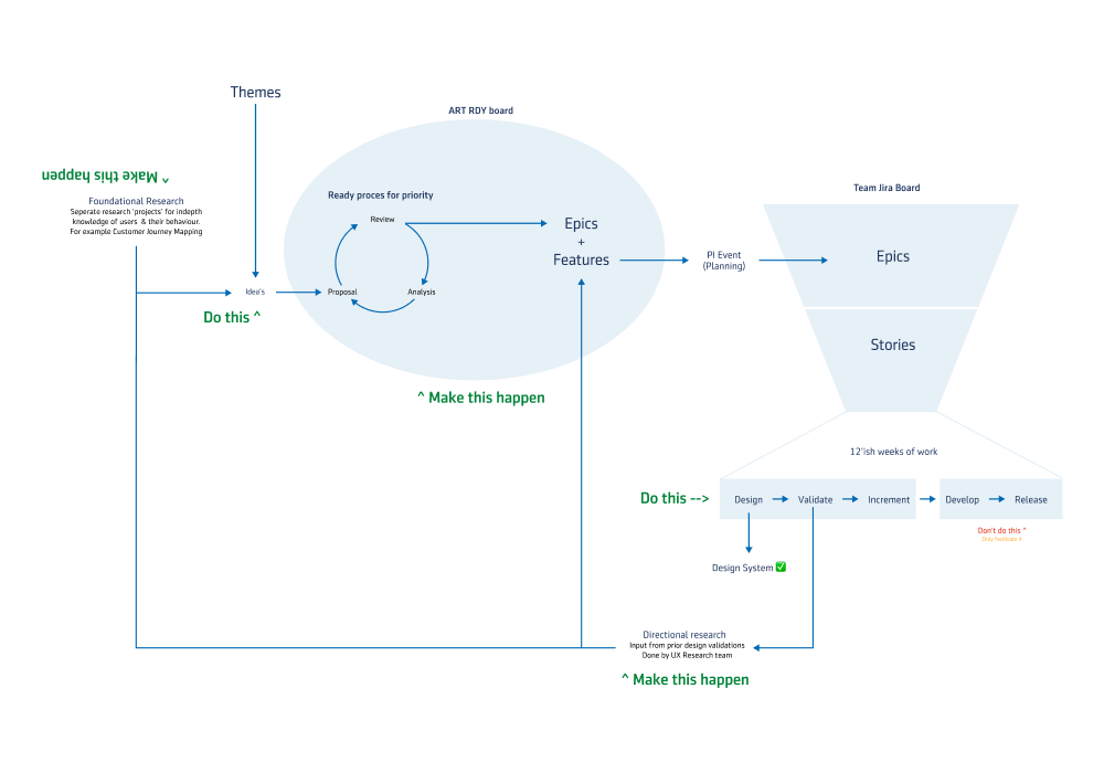
Connecting to the Safe 5.0 methodology we started up doing PI planning events. To prepare we analysed different data sets and went around the organisation looking for potential workloads. We found many and by applying rational guess work we could prioritise them on impact vs effort. During the PI planning events we started at the highest priority work and together planned how we could apply the triple diamond approach creating a manageable way of working. At the end of each 2 week sprint and 3 month cycle we facilitated retrospectives to look back and learn how we could further iterate and improve on our way of working
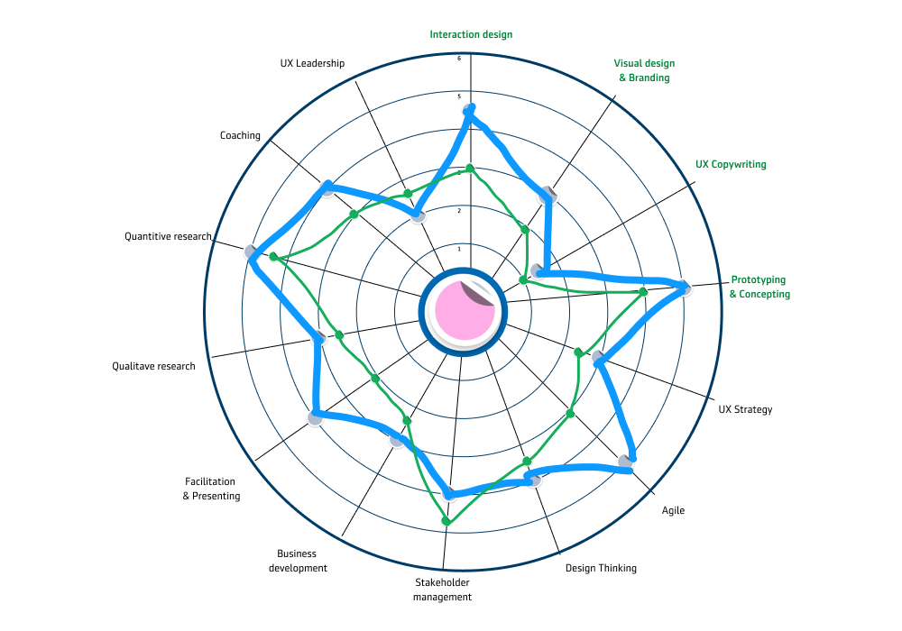
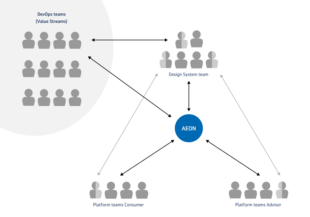
Upon entering Aegon I was the first in-house Designer. During the almost decade preceding me we worked very closely a partner to help us through providing designers when needed. This allowed Aegon to get used to design as a discipline on a flexible and cost efficient basis, but made it hard for us to grow beyond the operational level. Most DevOps teams in the business units had a UX Designer in the team, this scattered organisation of the capability was one of the major blocking issue’s. Another issue we kept running into is that the external designers could leave whenever they wanted to due to their relation being with our partner, whereas we felt the pain of all the knowledge suddenly leaving and having to deal with the high turn over of people.
I set out on a journey in Aegon to prove the value of Design on a higher level that is inline with the set business goals to create an internal budget for an in-house team. During this period there were several cost-reduction programs active in the organisation that made the business case earlier when looking at the bottom line. But simultaneously proposed the question: “Do we even need designers if we have a Design System?”
I made the decision to approach every UX design position one by one. My personal conviction is that a designer can only achieve its maximum potential if its surroundings are adequately shaped. If we manage to find talent but is placed into a team with a very controlling product owner who does not see the value in his added value it would only lead to frustrations. As a side effect this allowed us to do a bit better with each position filled.
Together with product owners, business information analysts, managers and other influential stakeholders I mapped out how we can most efficiently embed them in our digital service creation processes and what we should expect from them. Together with a solid Business Case this removed most if not all reservations they initially had. As an extra we kept track of how our Design System positively impacted our digital service delivery with a good story on why this can only be possible if we have designers in-house.
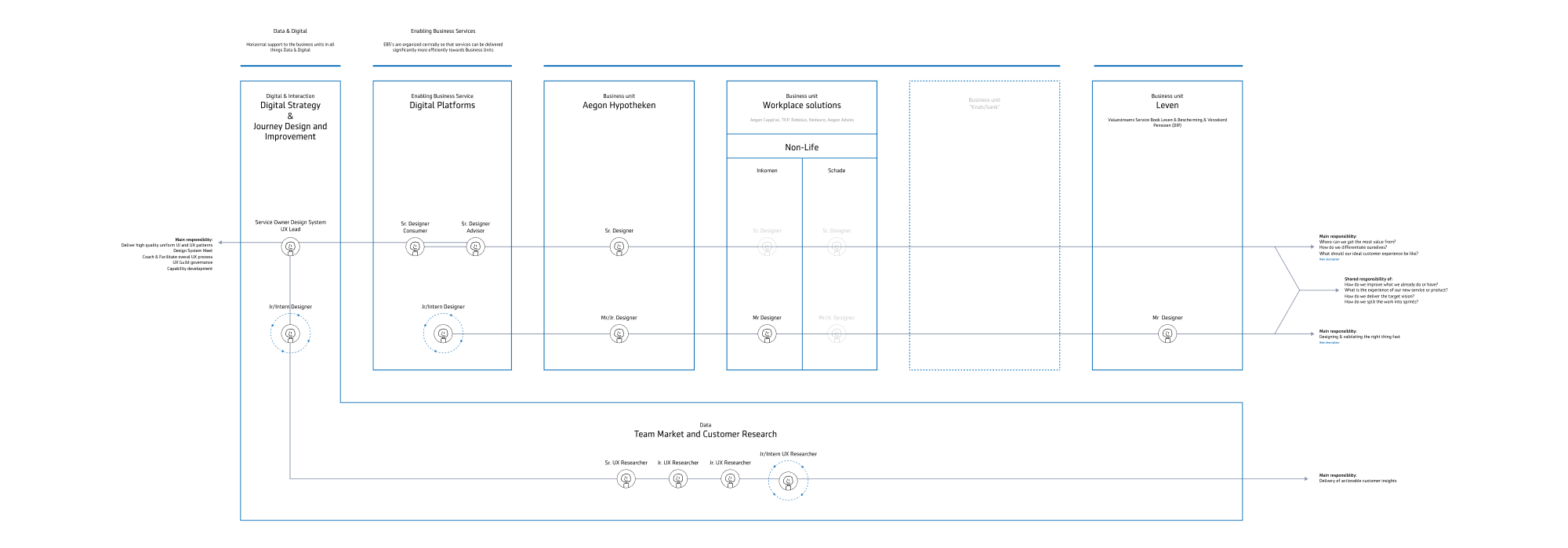
As the Design team started growing we were becoming more and more visible. By attending company wide events with strong case studies and popping up in demo’s left and right our story moved through the entire organisation. In less than a year we’ve created a central hub for all things design and were connected to most if not all parts of the organisation.
In an organisation as big as Aegon there are always some locations where its hard to make a business case for an in-house designer. To make sure we could still support and build our influence I’ve set up a internship program together with HR. Each quarter we’d do presentations at the PI Planning events and ask around for challenging idea’s. I’d then propose these to potential interns to see if they were interested and motivated to pick them up at this big scary angry corporate.
We’ve had up to 3 interns each year who all made a significant contribution and impact on our organisation. From supporting our design and research activities up to creating new innovative idea’s improving our service delivery.
Finding talent was the first step. The second step is keeping the talent in. One thing that defines talent for me is enthusiasm for self development. Not working somewhere to work, but working some where to pursue a better self each day.
To help our designers on this I set up a few different consistent rituals:
These rituals all had certain boundaries to make them efficient and focused; enabling a safe space for all involved.
When I started at Aegon the product manager at the time asked me to help out with 2 important goals:
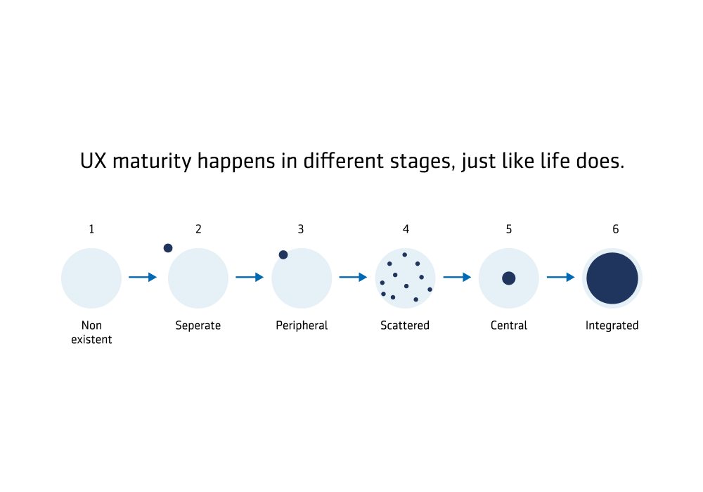
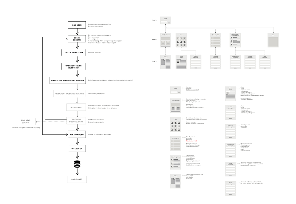
There was already a Design System in place but after reviewing it and gathering user feedback it was deemed insufficient. It was created on a free-for-all model and had very little to no management on the libraries which were approached from a product perspective. Build once and released in the hope everyone would use the same component. As a result there were over 10 different step indicators and confusion all around on how to effectively implement and maintain the system.
From start to finish it took about 3 years to achieve complete adoption. As the Product Owner & UX Lead I was responsible for the A to Z. From creation to adoption to company wide implementation. Below a few highlights of this journey.
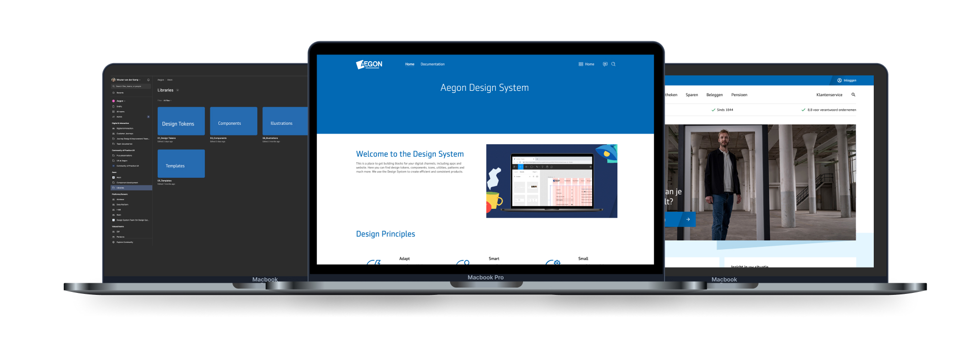
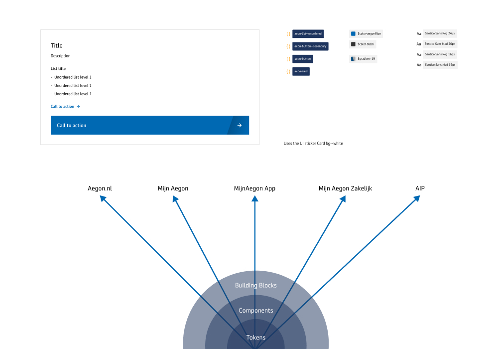
The initial team budget would cover us for a year. However we all knew that if we want the design system to be a success we need to approach it differently than they’ve done before. The starting perspective was that of a product; create it once and let other people have their fun. But as time goes on design patterns change and development languages get updates.
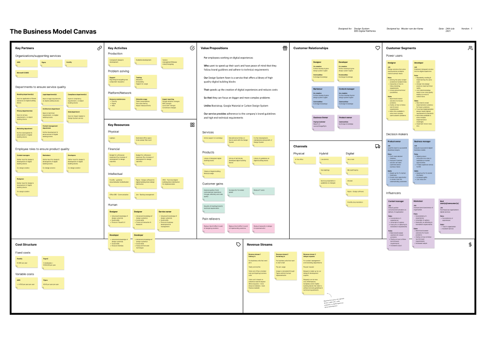
Parallel to creating the first version of our service we set out to prove a continuous business case as quickly as possible. Through a Business Model Canvas that we worked through with several stakeholders we created a clear view of what we wanted to achieve together. who we are doing it for and how we could get it done. Then by calculating our potential user base and the intensity of usage it was clear that we would gain the most by focussing on our developer’s efficiency initially. We defined intensity based on 3 things:
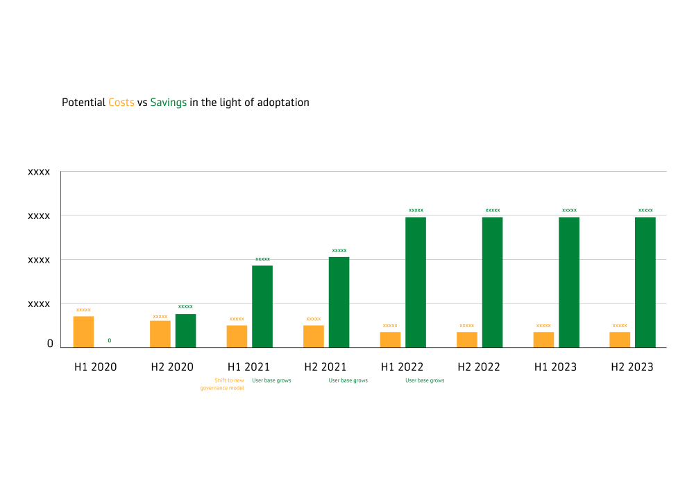
By creating clarity on what we were standing to gain on those three moments (and what we need to have that gain) vs a ‘what if we don’t’ scenario it became crystal clear that the gains far outweighs a continuous investment for a dedicated team.
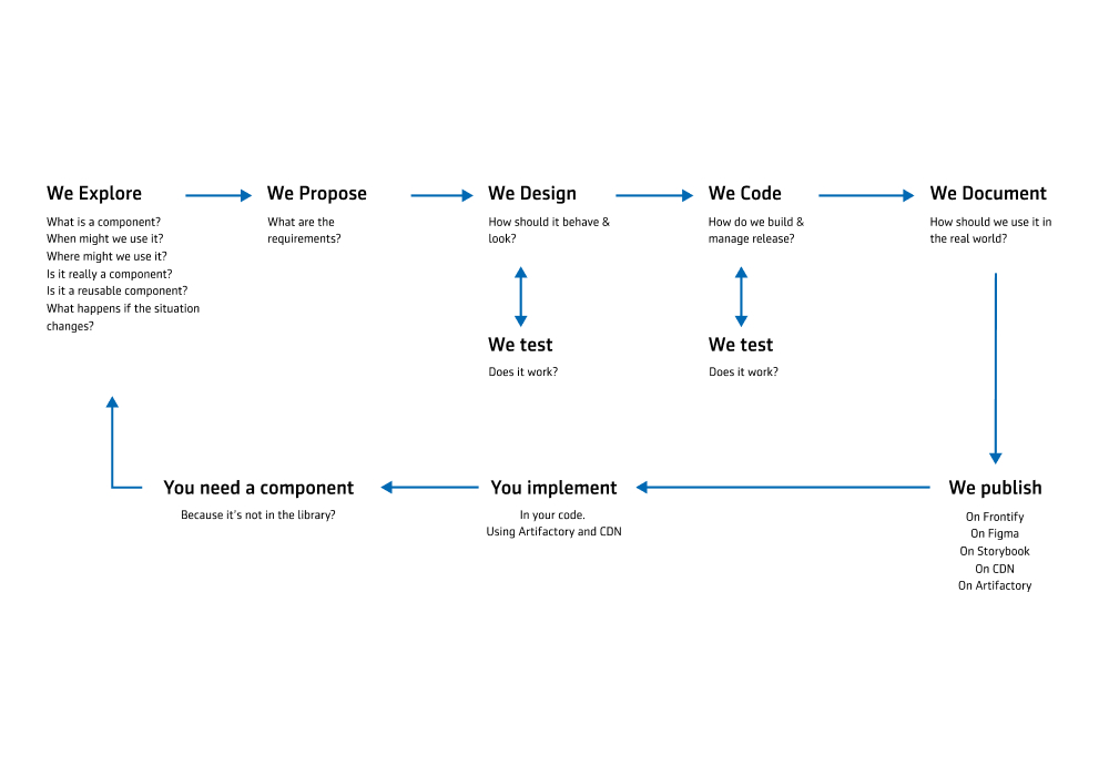
The shift from a product approach towards a service approach to ensure sustainability forced us to figure out a new way of working. Instead of building the design system in isolation we actively involved (potential) users in our decision making. In the first phase we did extensive research on what problems users faced in the previous design attempts and Aegon’s total digital landscape. We’ve set up several rituals on a bi-weekly basis to keep in touch with our users and a active support channel on teams.
Knowing that we had to prove our value as soon as possible we partnered up with our mortgage team, acting as our launching partner. This gave us a clear scope on what digital experience to systemise, continuous conversation, sharing of implementation challenges and an evaluation at the end. With this lean approach we went from 0 to live in less than 3 months and were able to prove our added value on all the promised key point indicators.
The big key difference with previous attempts is that we now have ongoing conversations that helped us create champions who actually wanted to use and implement our design system. As a result the quality is of a much higher level.
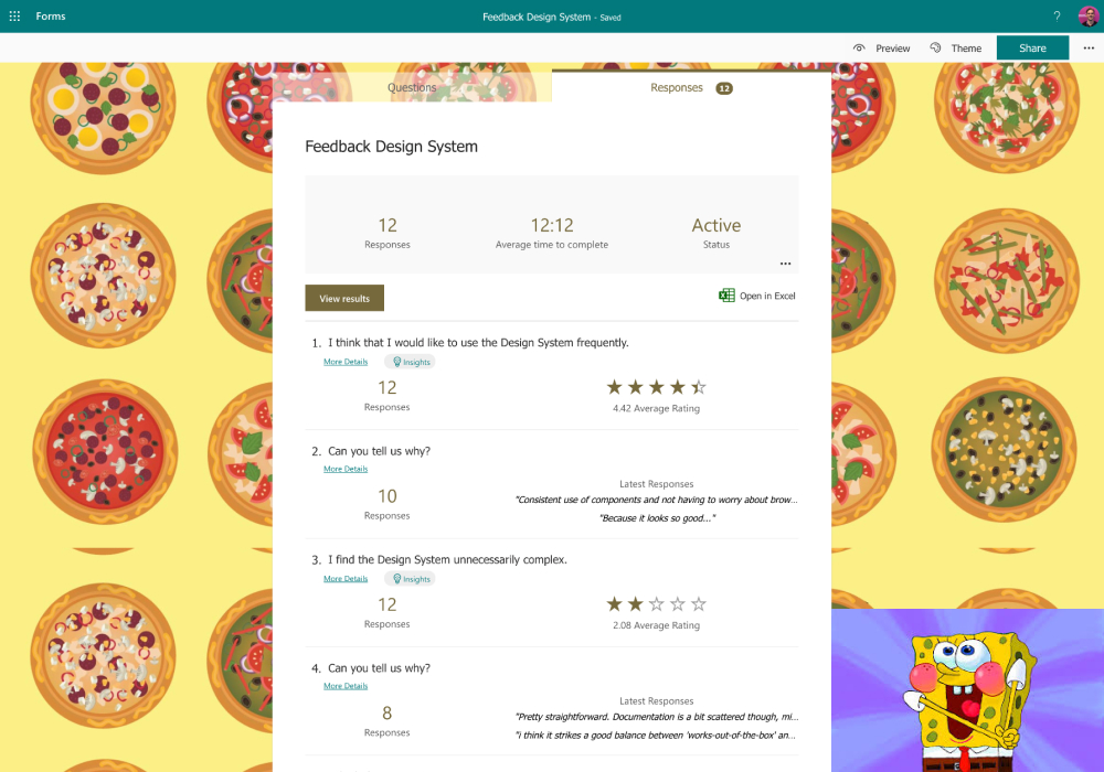
On a continuous basis we’ve been keeping track of how well the service is performing on 2 sides: those who use it such as designers, developers, marketeers and content managers. And those who experience it, our customers and advisors. After several different attempts we ended up by applying the System Usability Scale validation method for our users as this was the tool that told us the most on where we should improve and could be calculated towards an NPS score which made sense for management. As implementation spread out around the organisation we’ve kept track of the before and after impact.
Due to our way of working we could release a new stable version every 2 weeks with clear communication on breaking changes & how to negate them. Teams were always in control and responsible themselves on what version they are on and if they felt the need to update. This approach has led to seamless iterations on our components as requirements grew. For example by adding digital accessibility or security demands.
Whilst I was working at Online Department we were contacted by the Marketing department of BENU. They asked our help with 2 different challenges:
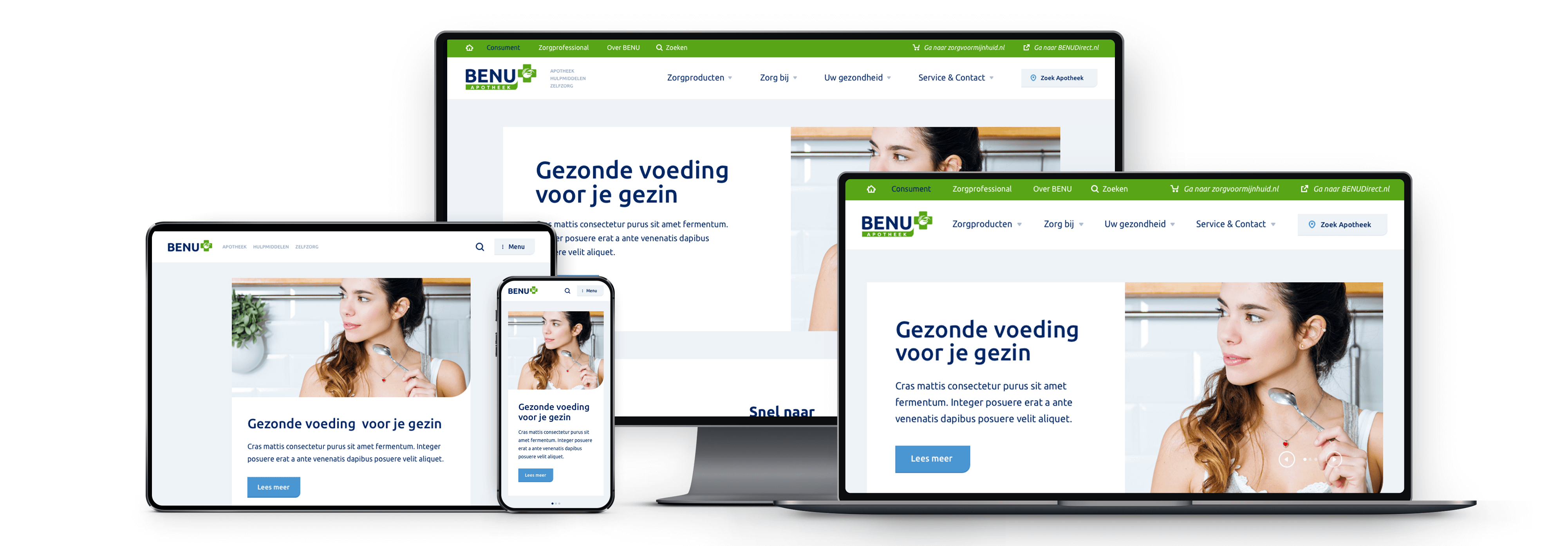
After taking over a competitor and becoming the biggest pharmacy in the Netherlands, a lot of different branding styles and other inconsistenties appeared. Their wish was to become a more unified & consistent brand. What made this challenging however was that their IT landscape was quite outdated and needed an upgrade. Meaning contracts ending and deadlines appearing. The timeline goal was to go live with the new digital products at the same time when the new IT contracts started running.
Below are a couple of highlights from this 6 month project. As UX Lead I was responsible for the overal UX & functioning of the UX Team. Although these are just a few highlights, I have many more stories to share. Feel free to contact me if you’d like to know more.
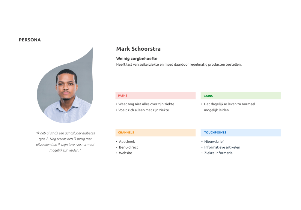
After the vision was established by the deciders it was up to me & my team to find out how big the gap was between the current state & the desired future state. We decided to out by getting a better understanding of who the end users are and the kind of questions they ask. At this moment in time there were 2 ways to ask questions at BENU; 1. Via phone or 2. At the pharmacy desk. Hence we took an afternoon to interview and sit next to their experts on the phone and we took a day to visit their franchisee’s to interview their pharmacists and the people who walked in. While at the pharmacy it turned out to be no joke that their IT landscape was outdated. They were still working with Fax machines.
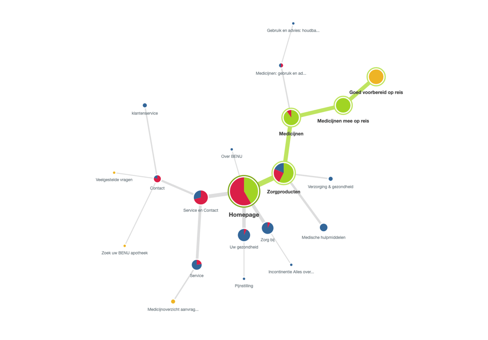
From the data dat we captured on these field days we created several persona’s based on the degree of care that they need and 1 persona or the health professional. These would be the foundations on which we will create the new content platform and make several strategic decisions and UX designs.
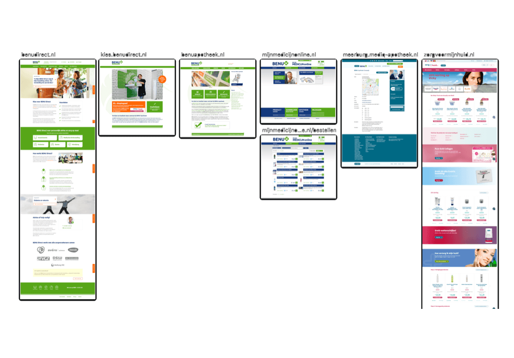
Although we interviewed several pharmacists about their needs & frustrations around their current digital solutions, it didn’t yet give us a feel of the current inconsistencies of the BENU brand. That’s why we decided to do an extensive analysis of all their digital interfaces, and of their competitors. Combining this with data from the interviews we learned that their franchisee’s really appreciated their staying themselves and not being ‘ruled’ by the brand. This insight would help us designing their new digital representation.
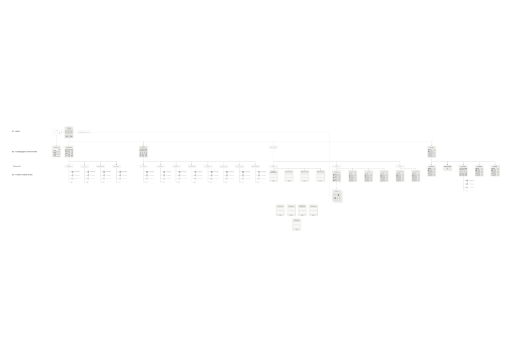
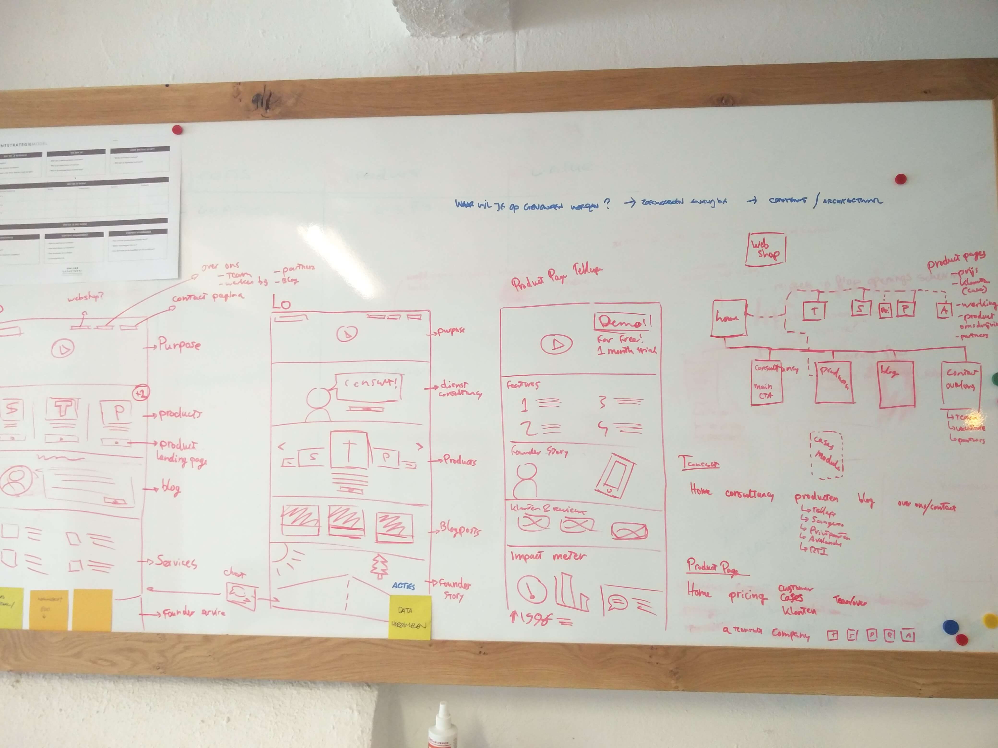
We were starting from scratch for the new content platform but we didn’t want to waste prior content & information. We combined the findings from our research about what people would like to find with the existing content to create a new information architecture. After setting it up together with their Content division based on our own professional experiences, we put it to the test with a Tree Testing. We formulated a couple of questions based on prior research insights and sent it out to 40+ respondents, all of which fit in 1 of the persona profiles. The results were used in tweaking and perfecting the site content structure.
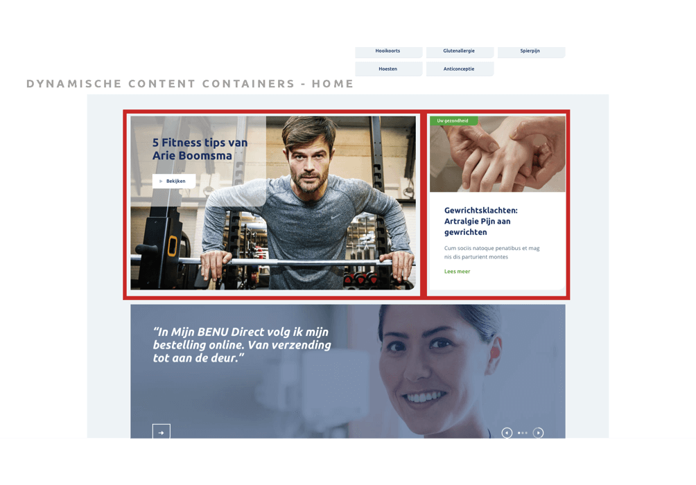
Early on in the project the decision was made to upgrade a part of their IT to Sitecore. One of the reasons was that it offered the possibility to work with dynamic content. Meaning that every person who looks at the website would have content offered to them that would fit them better than generic content. For example; if the data (from prior visits & account) shows a high possibility some one is diabetic, we can show them content specific about diabetes and such.
To set this up we took another look at the persona’s en created a scoring system. For input we looked at the market their active in, the content & products they offer and the insights from the prior interviews. We set up 4 scoring fields; Measure of care-use, health, chronic issues and incidental issues. For each persona we created a spiderweb that the system uses as ‘profiles’. Based on behaviour a user can fit in 1 or more profiles and get the profile specific content shown to them in the dynamic content containers.

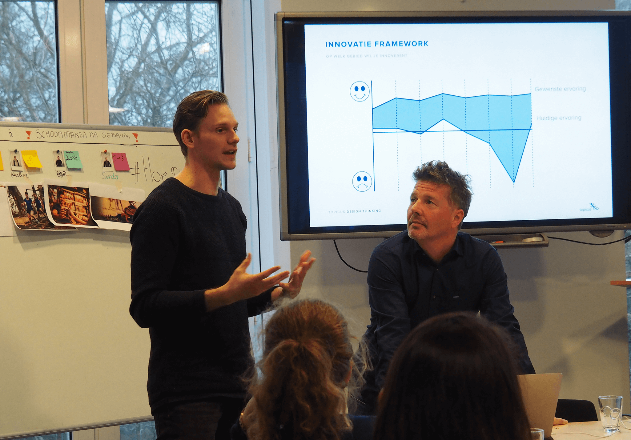
During my time at Online Department the change agent working for Topicus approached us with the question if we could help them with a company wide change program he has set up. They would like to expand their service offering by switching from product oriented to value oriented, using Design Thinking as a base.
Topicus is a software building company of the highest quality. Focused on banking activity and healthcare platforms they deliver IT with a passion. As the market is evolving so are they. To help them we created multiple training programs focused on creating, improving and stimulating the human centred mindset. Our unique offering included more than just basic training. Doing thorough intakes with DISC tooling and offering coaching & guidance during and after the programs allowed us to create a unique learning experience. Tailored specifically to those who joined in on the program.
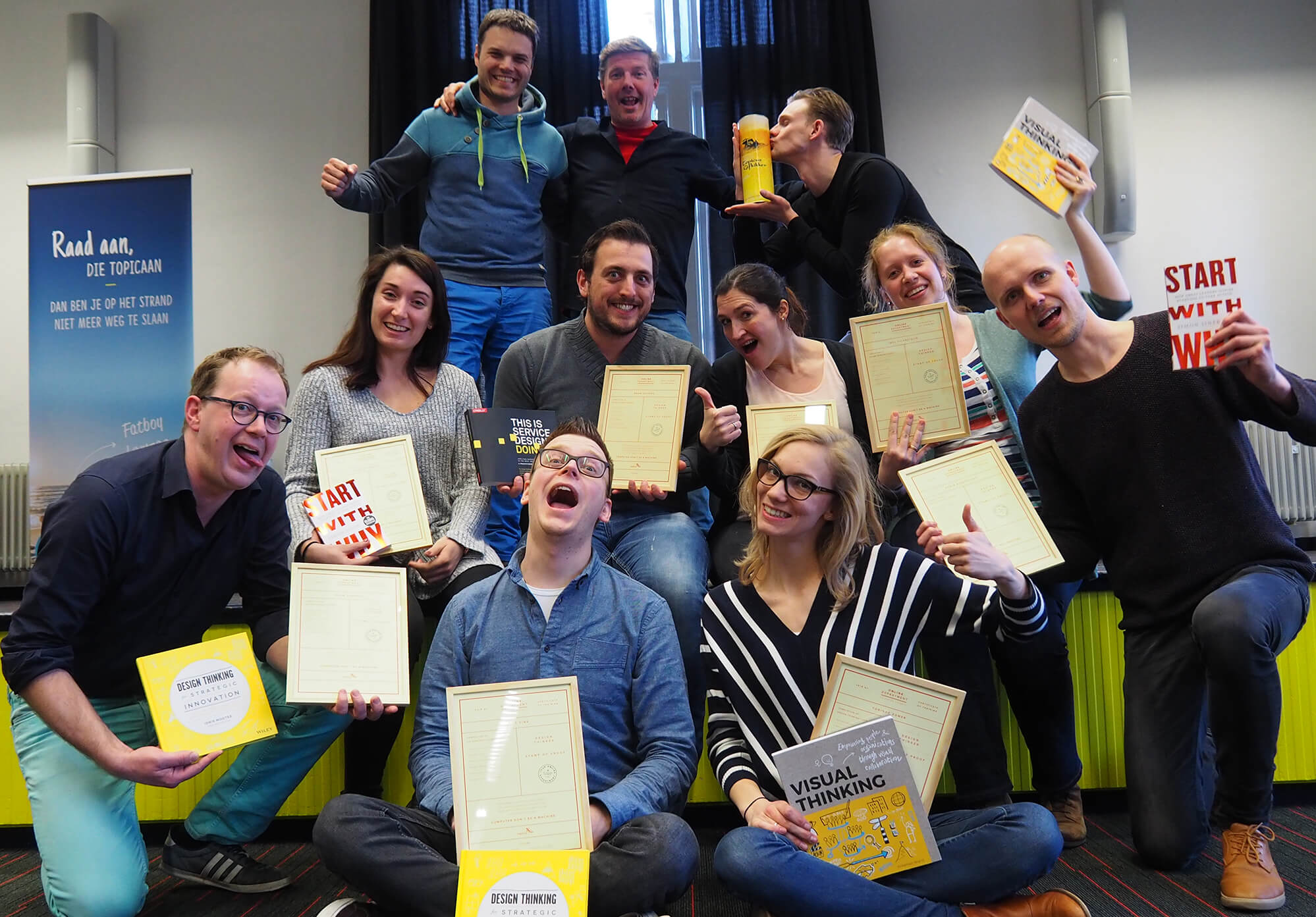
Below a short summary of the 1,5+ years that I’ve been part of designing & creating this program, that is still ongoing. I’ve designed, created, executed and coached during this period. I’ve taken out a couple of highlights, but have many more stories to share. Feel free to contact me if you want to know more.
Together with the change agent we devised a strategy on how to introduce the new education program into the organisation. Based on the fact that it’s been tried before by others but never had any succes, we knew we were in for a tough cookie. The general consensus was that they were tired of these attempts failing. Knowing that we started by asking around in the organisation for names of who they thought would have the most succes with the new program. We named those people ‘Champions’ to create a feeling of special. Something we’ve been using on until this day, noticing that it helped spur others into motion and activate others.
We capped our maximum trainee’s per group at 10 to increase scarcity. Every employee that applied was taken in consideration to join the program and every entry was scheduled for an intake interview + DISC test to gain a better understanding of who they were, what they wanted to learn and why they were willing to join. Combined with the results of the DISC test this allowed us to create harmonious group allowing us to design an optimised learning environment.
The program consisted of six trainings of about 6 hours each with weekly intervals. Six hours is a bit short, so we designed our program to touch the most essential parts of Design Thinking and offering extra coaching for more deep dive moments. Using the first half of the day for theory and the second half for practice, we focused heavily on a ‘Learning by Doing’ foundation.
During the training days we went through the entire Design Thinking process, one step per day. The first day was all about understanding what Design Thinking exactly is and how it differs from other processes. This helped created a better understanding of possible challenges ahead and how we could more easily integrate it into the day by day flow. From this starting point we created a fictional assignment to work on for the rest of the program.
After working through the 4 Design Thinking steps (Research, Insights, Ideation & Concepting) we used the sixth training day to circle back to the start. Designing new way of workings with Design Thinking incorporated that would work for their personal context. Most of the times this would involve spending half a day on getting familiar with Design Systems.
Following a training to learn something new is one thing. Actually putting your new skills & tools to use is something entirely different. That’s why we offer individual coaching for all our trainee’s. After experiencing 6 days where we touched a lot of subjects every one of them was enthusiastic about something and wanted to drive that change. During coaching sessions we helped them overcome hurdles (for example stakeholder management) and supported them with our own experience & knowledge. This helped them to quickly achieve results and improve the products they are currently working on.
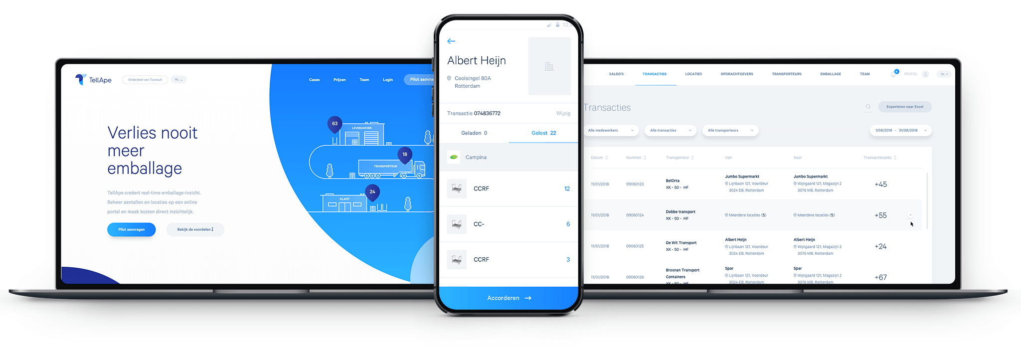
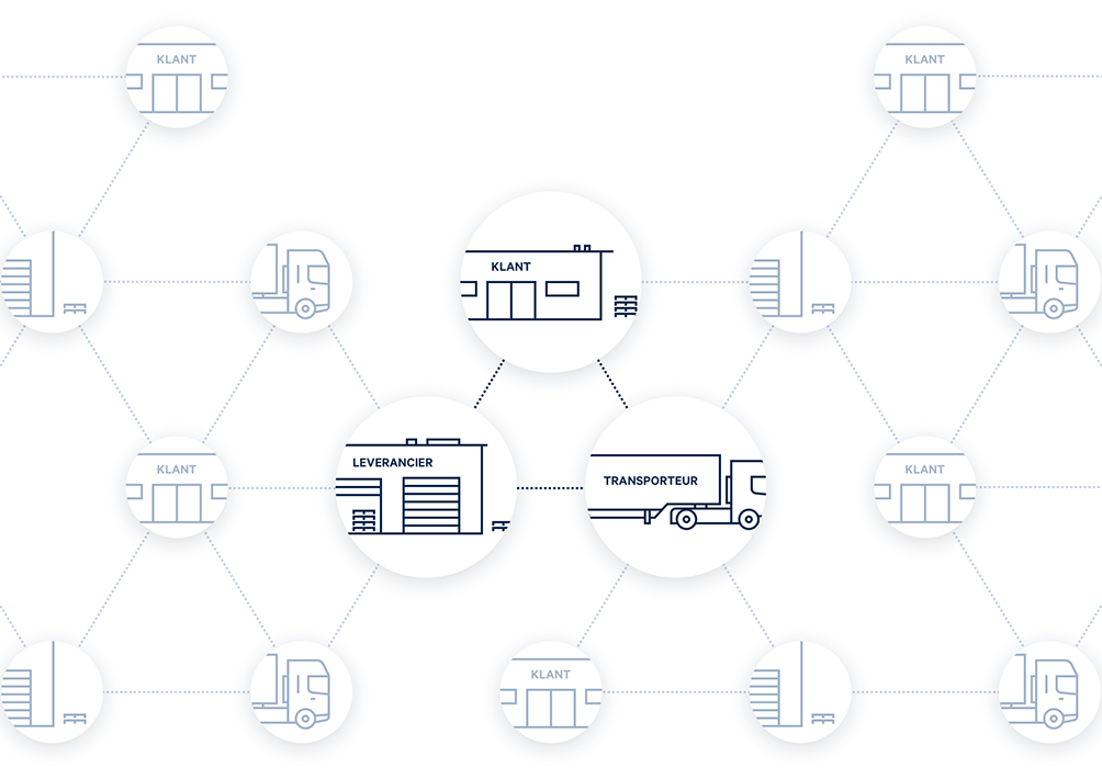
During my time at Online Department I’ve had the opportunity to work with this amazing entrepreneur. Extensive research done by him has shown that transporting packaging is experienced as ‘just’ a wooden pallet or ‘just’ a cart by those who work with them. Hereby underestimating actual value of said cart or wooden pallet and resulting in high amounts of losses and unpleasant disputes.
TellApe aims to help companies achieve insight in their transporting packaging by offering easy & low acces methods of registering incoming and outgoing packaging. Ultimately giving their clients peace of mind by creating a higher level of ownership of their products. With just one click they can see where it is, exactly what packaging, if they have a surplus or deficit and if they owe some one or they them.
Below is a short summary of the 2+ years that I’ve worked on this project, that is still ongoing. First from my role as a Researcher & Interaction Designer, later on as a UX Lead. I’ve taken out a couple of highlights, but have many more stories to share. Feel free to contact me if you want to know more.
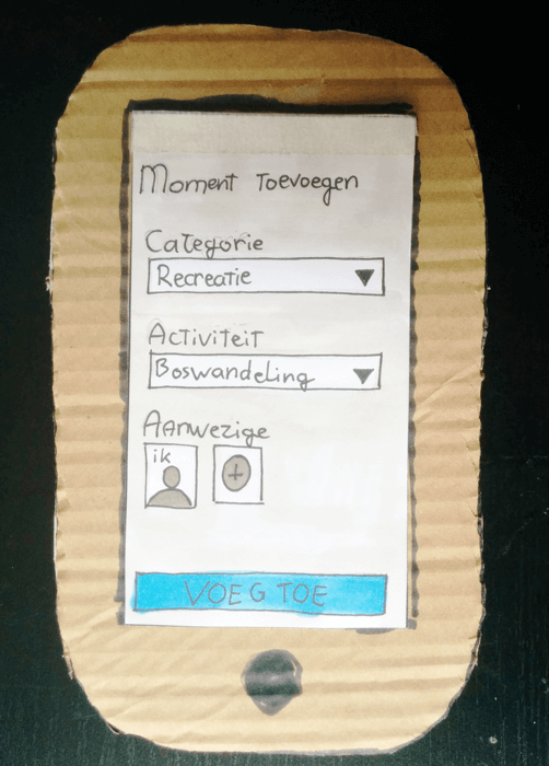
Although there was a lot of research done on the business case there was little known about the behavioural patterns of potential users. Normally this would mean that we would do some interviews and user other tooling to get a better understanding. However the client being a start up brings certain constraints (Time & Budget) and with it gives us the opportunity to experiment with more lean & agile research methods Instead of doing extensive research up front we used paper prototypes to quickly envision what the client had in mind and presented this to possible users. From there we could start up an explorative interview to better understand why something would or wouldn’t work.
In a couple of days we validated our paper prototype with various transport companies, wholesalers and exporters in the western part of the Netherlands. With it we validated the business case and developed a better understanding of their habits, used IT solutions and product eco-systems around packaging materials.
After gathering and synthesising all our learnings into insights we took a step back to re-evaluatie our prototype. Although we were going in the right direction it was missing essential features to be of real value. One of the biggest hurdles we identified is integrating this new product into their eco system. A lot of data is already available but only on certain channels. If we could use that as a starting point it would save them even more time. Unfortunately most of these channels are part of a closed system circuit, making it hard to gain easy acces. Another learning that we came home with was that by just eliminating the paper trail we could get their IT from fax into the digital age.
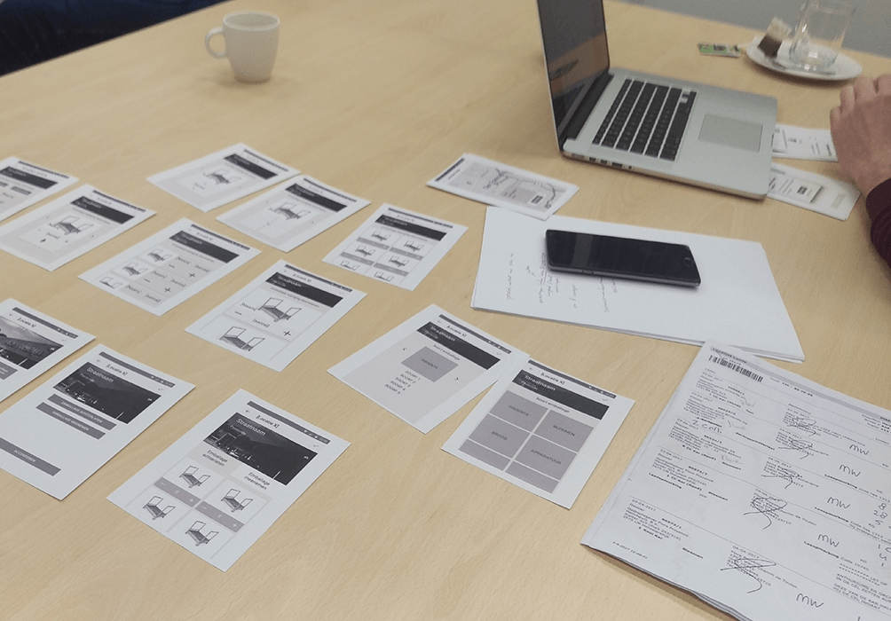
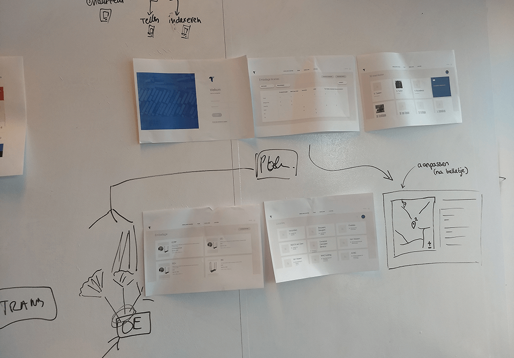
We put the new possible features through some ideation sessions to see how they might work and re-designed our information architecture. Adding an entire new product to the offering; a desktop application to manage all the data captured by the mobile applications, on which employees register ingoing and outgoing packaging. Through the desktop application the administrators can manage and control all drop off & pick up locations, customers and get up to date insight on where their packaging materials are. Which is based on all the transactions logged by the employees.
When we launched the application our main focus shifted from adding features to perfecting the application and optimising the user experience. We’ve been doing this by constantly making small changes and by expanding the eco-system that the client wants to offer. We helped the client shift from a purely consultancy focused company towards an asset based consultancy driven by a purpose. For more information take a look at https://tconsult.nl/ or https://tellape.nl/
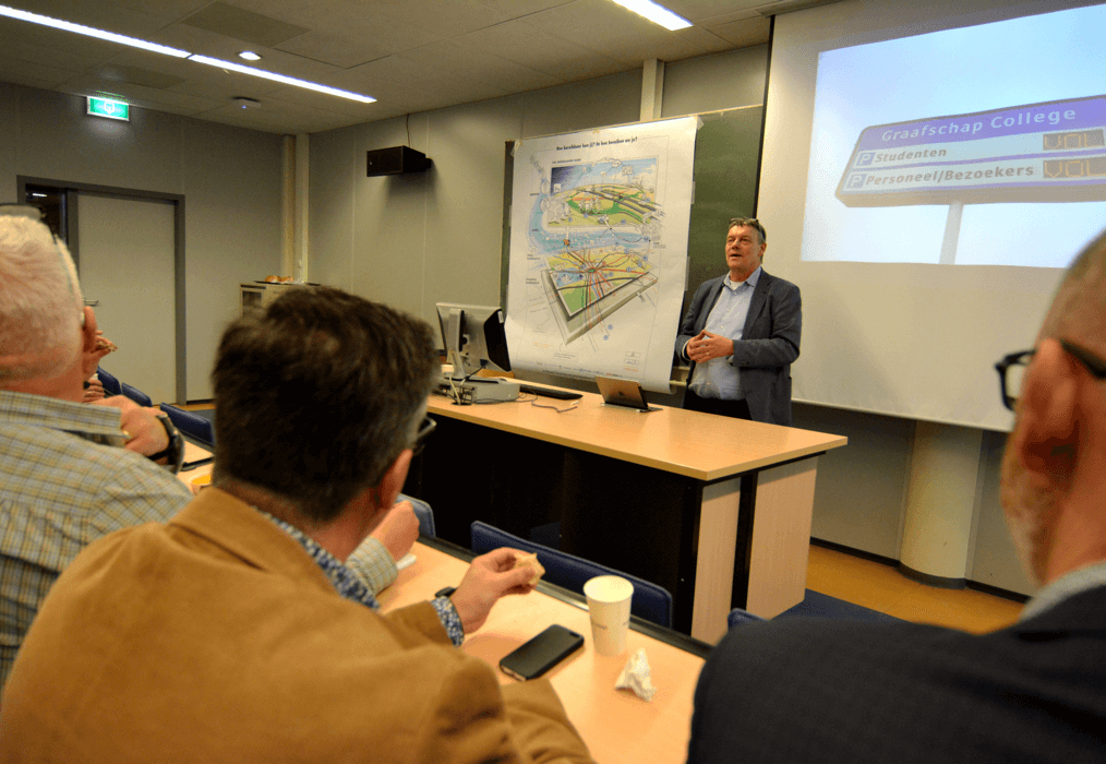
At a school in Doetinchem there is a shortage of parking spaces. Which is quite troublesome for everyone involved, including surrounding neighbourhoods. But how do you solve this shortage if you can’t build more parking spots? By looking at the eco system in which the problem occurs and mapping multiple cause and effect relations a different perspective presents itself.
Below is a summary of the project. The emphasis of this summary is on the work I’ve done with the employees of the school. Parallel to the design sessions a lot of research has been done in different area’s. If you want to know more about this don’t hesitate to contact me.
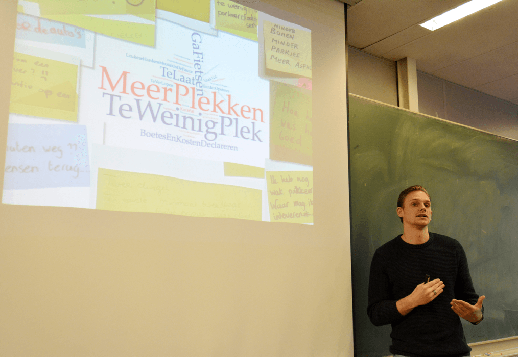
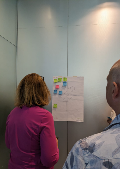
To create a new perspective on the problem its paramount that everybody gets on the same page. To do so the participants have been asked to write down post its about how they feel about the problem, what they see, smell, hear and experience. By developing a common ground everybody can move towards the same goal at the same pace.
For a better understanding on why everybody parks we explored our daily rythms. At what time do people come to the school? Why do they take the car? What happens before and after their work hours? It turned out that some have to take their kids to school first, need to do grocery shopping after or have a big distance to cover.
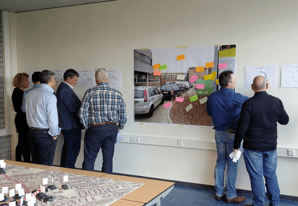
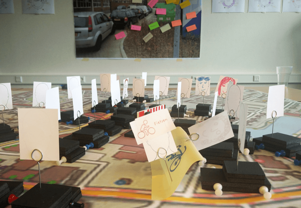
On a big printed out map of the school and surrounding area the parking space has been marked with little cardboard cars. The participants have been asked to replay their experiences when arriving at the school. While doing so they started to wonder where everybody came from. And why is everyone taking their own car? This takes up a lot of space! And there is a shortage of space.
Currently a lot of innovations are on their way in the field of mobility and transport. Such as Elon Musk’s Hyperloop and Google’s Smart Car. By mapping a dozen of these upcoming innovations on a timeline the participants were challenged to start thinking outside the box towards new and upcoming solutions.
Einstein once said: “You can’t solve a problem by applying the same level of thinking”. Meaning that sometimes you need to distance yourself from the problem to be able to see a proper solution. The participants have been asked to solve some one else’s problem, similair to their own, by applying the new and upcoming innovations.
By visualising their new solutions with little pieces of rope, post its and small cardboard actors they could map out how they travel around. By placing all the solutions over each other a lot of overlap was found. Innovations will make it easier to travel to and from the school, but there will be more than just one. When do you know which form of travel will be the best for your context? What is step zero?
The proces to determine the best travel option is similiar to using an application such as Airbnb. Using the an analysis of the Airbnb user journey as an inspiration source, the participants have been asked to create their own user journey for traveling together.
Divided into three teams each thought up of a new solution. An interactive physical column to post carpool calls, a giant group chat to support traveling together and a mobile application that gives advice based on weather information.
Once again a lot of overlap between the different artefacts. All of the overlap occured on parts where a user was trying to find out what kind of travel options would suit them best. Making the choice of transport coming at the end. This overlap has been dubbed ‘Step Zero’. Getting the correct image of the context and chosing a travel options with the best fit.
After three design sessions a lot of different travel solutions have been convieved. By doing a recap of all the solutions everybody got on the same page and realized once again that these solutions will be a matter of time before they are realized. The first solution that can be quickly adapted is traveling together. But what will that take?
The participants have been asked to team up in teams of 2 and to have a conversation. At the end of the conversation the participants have made agreements about how they could travel together, keeping it fun for the both of them. By doing this we quickly found out what it takes to carpool. From simple, rational, things such as knowing where some one lives, name, working hours etc. To the more emotional factors such as possible car smells, drinking behaviour and taste in music.
In the fifth and final design session all the information has been visualized and mapped out. Giving a clear image of what all the design sessions have given us and how it adds up and is used in the prototype.
By going through the prototype based on a scenario together with the participants we were able to discuss every design decision that has been made. Such as colours, font sizes and compositions. The end verdict by the participant group was fun to hear: “When can we start using it?”
Recent developments related to the epic age of technology have amde society become more connected through digital means. But on the other side more disconnected on a phsyical level. While this becomes of higher importance when one ages or is in the need of care.
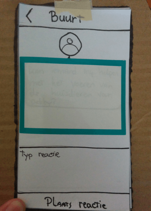
In a little town called Naarden there is a street where people have asked for help to become more connected. While time passes they are growing more uncertain about available sources of help from their neighbours. The human ability to empathize is what triggers people to help one another. Stimulating the empathy of the residents is central in both the end product and during the design process.
Below a summary of the project. Interested in what I’ve learned and where I missed up? Or more in depth information or questions? Feel free to contact me.
Before you can design a bridge, an end product, you needs to research the area and solve several challenges. Such as what kind of banks the bridge resides on, what will run under, weather conditions, available resources and much more. But in this day of age I’m not the first one to create a bridge. Therefore I did an analysis of possible competitors and researched different models about why and how people aid others in need.
Based on the found information I created a first paper prototype to be used during the first design session. The goal of this session was to connect with the residents, gain their support and show them how easy it is to actually create possible solutions they have in mind.
During the design session the participants jumped aboard and were happy to help out. But they asked to not specifically focus on situations about health care. Helping out with throwing a party is equally important, in such situations one really gets to know one another. And based on that connections they will aid others faster.
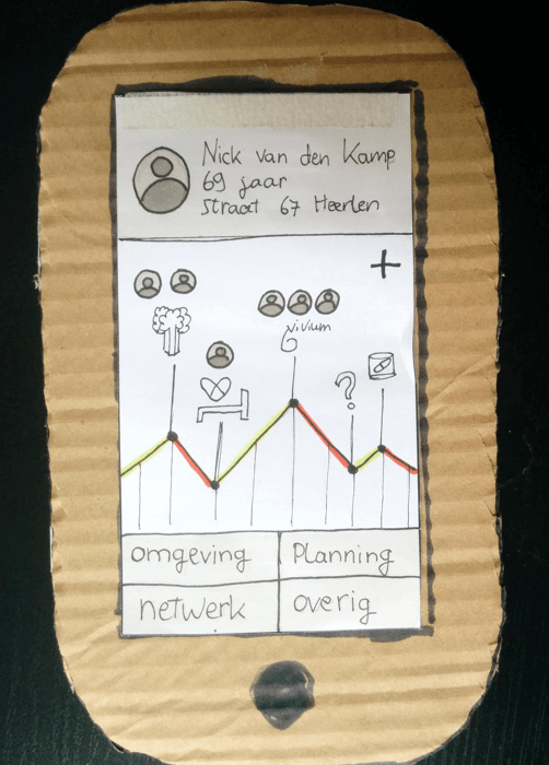
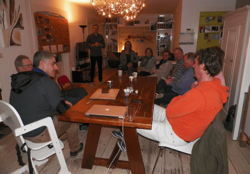
To get to know the participants better I’ve invited them over for a beer in a local pub. Due to the comfortable setting (and alcohol) we had a normal conversation, instead of an interrogation style interview. During the conversation we spoke about what triggers them to take action and what it takes for them to decide to help some one.
There is a big variety of triggers, obstacles and other factors the to-be-designed solution has to take in mind. For example insecurities (‘I don’t know how to help’) and timing (‘If I’m already at the supermarket I don’t mind picking up his dinner’). But there is one common process they all follow. First they have to know something is up, then find out more about what’s going on and so they then know how to act and help some one.
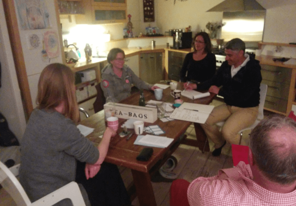
Based on this new information I created a new prototype for the second design session. This prototype simulated a new way to notifys other they could use help, what kind of help and communicate about it by sending messages. During the sessions they wrote the messages themselves and discussed them afterward. The participants did not need any help making their questions and answers clear. But they would like to have ways to show the importance, categories and mark things private.
Parallel to the end product development I went on a search of how other available technologies could enlarge the add value. As technology keeps advancing, more and more sensors are being applied. This creates a new network of information that can be put to use. For example context aware notifications based on a combination of location and questions asked. Or applying datasets to support how a user plans or asks something.
By mapping the involved entities, relations, attributes and flows, for different situations where the end product can be of use, it is easy to see how a surrounding system and external datasets support the user. The new insights this has generated have been taken in account during the development of the third prototype.
For the third design session the prototype was printed out and laid out. The participants were given the goal to organise and communicate different events, from barbecue’s to laundry to aiding some one, while obstacles occurred. The participants were very happy with the product layout and concept. All the feedback was on product level, interaction and copy.
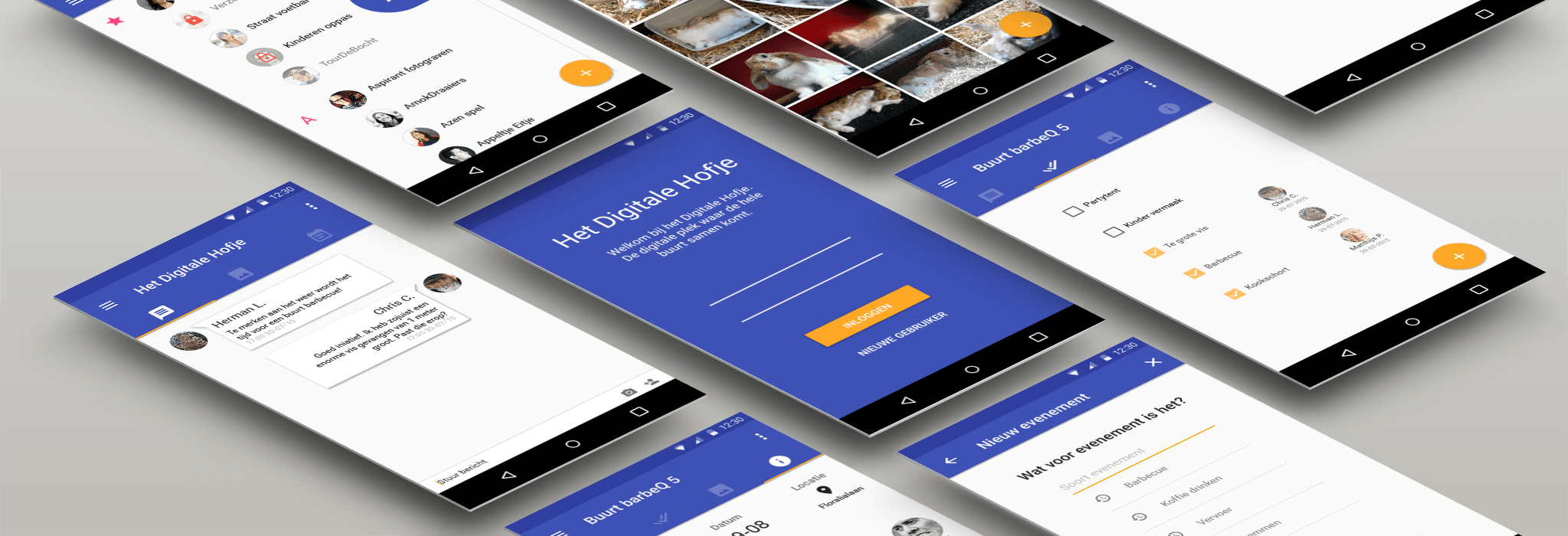
By now the product was still mostly wireframes. It was not pleasing for the eye and didn’t give off a lot of emotion visually. Also when wanting to develop the first version there are multiple constraints one has to keep in mind, such as finance and development restrictions.
By applying the google material styling many of these constraints were overcome. For the visual design the colours blue and orange have been chosen together with the participants. Blue eminates calmess and responsiblity and orange eminates change and health. All important in the context of this product.
With this the first high fidelity prototype was created and the concept finetuned. The participants were very happy with the end results and are looking forward for the first developed version. Meanwhile I decided to do some more in-depth test with a new group of participants to get more feedback. Once again the feedback was only on product level, agreeing with what the concept could mean for them and it having added value.
At the start of the project the street was divided in three small social communities. By having one or two inviduals from each community in the design sessions hey have gotten to know each other better. Now when the sun is out they have 1 big street barbecue instead of 3 small seperate ones. From this I can conclude that the social connections in the street have been changed for the better.
The end product, the mobile application, is yet to be realized. Due tot different changes in the municipality it was not possible to acquire a funding budget.